Take a look at this monthly XRP chart. This thing is absolutely gorgeous. XRP has held this trendline back to May, 2017. So, what’s the best-case scenario? Some of you probably already know just by looking at this chart.
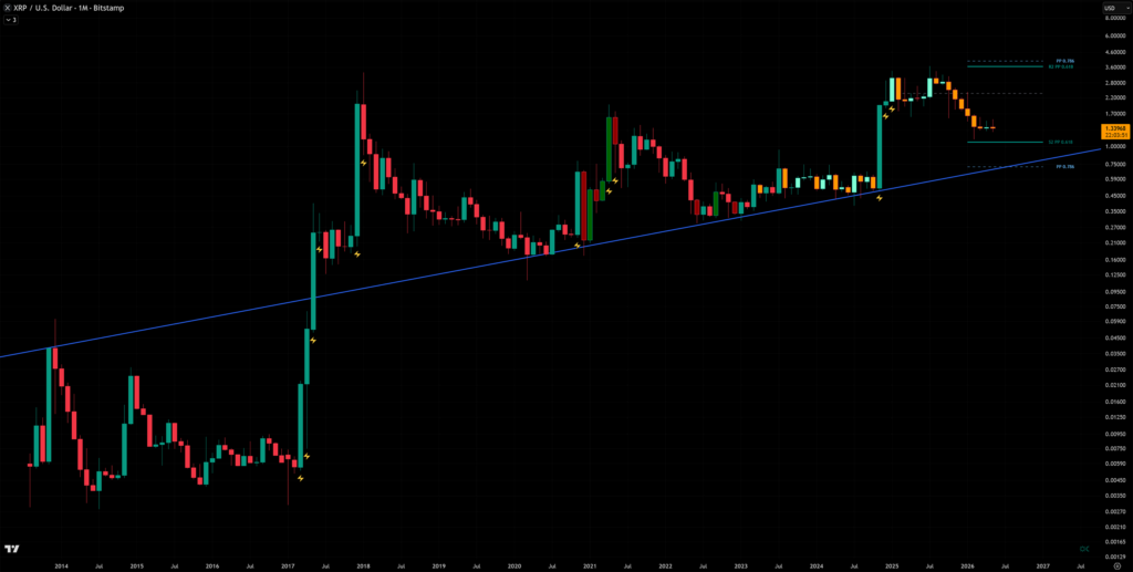
About the Chart
The chart above shows the XRP price on the monthly chart with 2 additions.
2 things I added to the chart:
- Blue trendline showing 19 touch points
- Fibonacci indicator showing the pivot points 0.618 & 0.786.
The Fibonacci pivot points are the green and blue dotted lines on the right side. After I put this chart together, I was like, “Wow, this turns out to be a pretty powerful chart.”
Analysis
The best-case scenario for XRP would be to hold this trendline marked in blue. The trendline I’ve added to the chart has 19 touch points that date back to the beginning of XRP. This trend line has some serious history.
Serious history = Strong support
Look at how the trendline lines up with the Fibonacci pivot point 0.786. Right now, XRP is going to find support at the 0.618. If this breaks, we move to the 0.768, which aligns almost perfectly with the trendline.
The 0.786 is right at $0.72.
$0.75-$0.40 was the price projection I posted on my private Facebook page back in March 2026. Here’s a link to the public Facebook page I just launched.
Further Analysis
I’m expecting Bitcoin to have another leg down, and most altcoins, including XRP, will follow. Altcoins as a whole are still bleeding to Bitcoin. In short, this means when Bitcoin drops, they drop more in price.
Worst-Case
The worst-case scenario for XRP would be if it breaks below the trendline shown on the chart and a candle confirms it. If this trendline breaks, you could be looking at some ridiculously cheap XRP all the way down to $0.40
I’ll have more analysis coming out soon for the XRP fans.